

1
Feature Story
Bar Graph Maker
Aug 28, 2023 · news.bensbites.co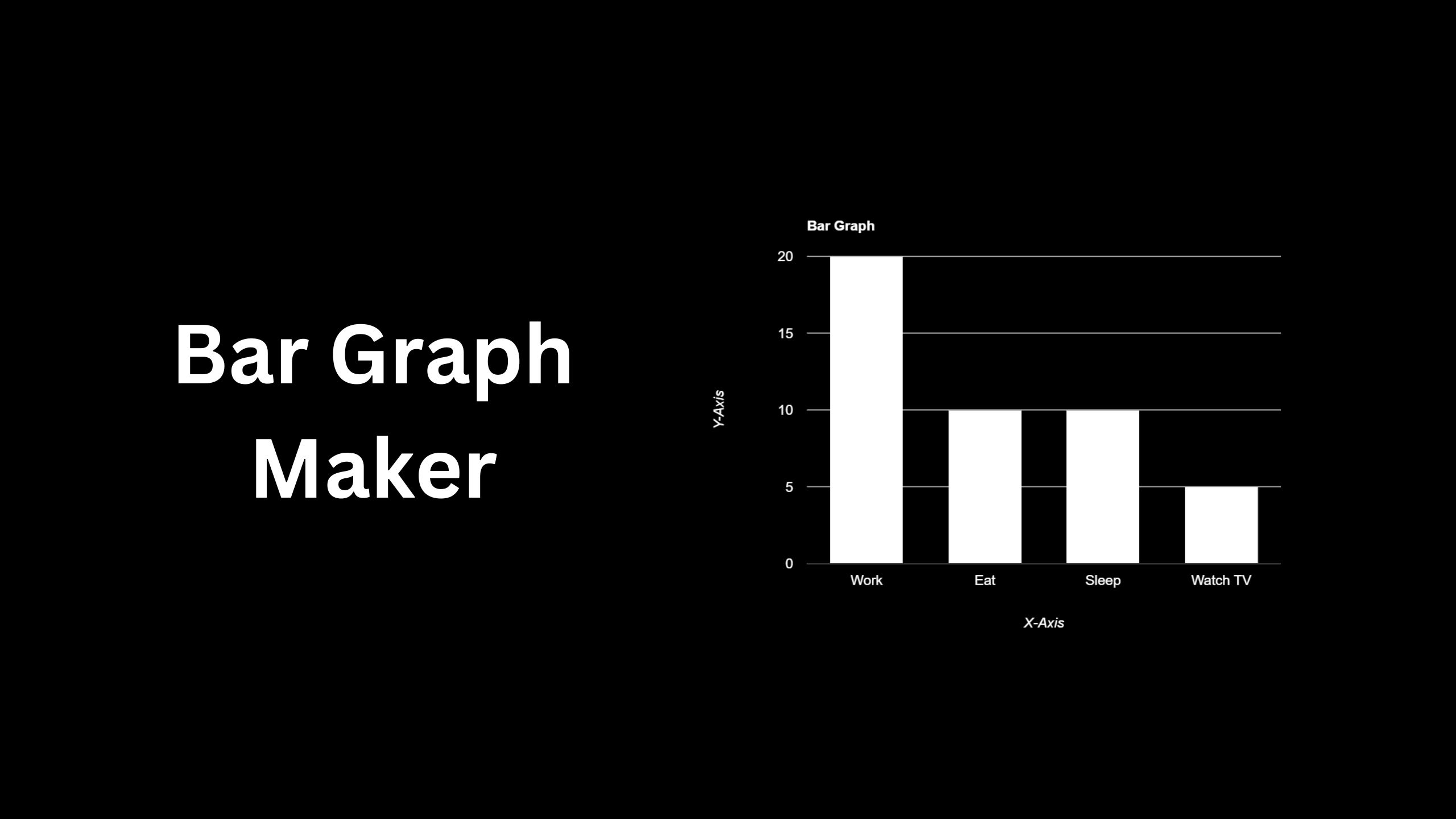
The article also introduces the Bar Graph Maker, a tool that simplifies the process of creating visually appealing bar graphs. Unlike traditional software applications, the Bar Graph Maker allows users to input their data and generate a bar graph effortlessly. Users can customize various settings to meet their specific requirements and preferences, making it a convenient tool for all data visualization needs.
Key takeaways
- A bar graph is a visualization tool that uses rectangular bars to represent different data categories, with the length or height of the bar corresponding to the value of the data.
- Bar graphs are effective for displaying and comparing larger data sets across different categories, highlighting trends, patterns, and disparities within datasets.
- The x-axis of a bar graph typically represents the categories, while the y-axis represents the values.
- With Bar Graph Maker, you can easily create visually appealing bar graphs by inputting your data and customizing various settings to meet your specific needs.